Alright, let’s jump right into the color that reflects from three quarters of our planet (including most of its atmosphere).
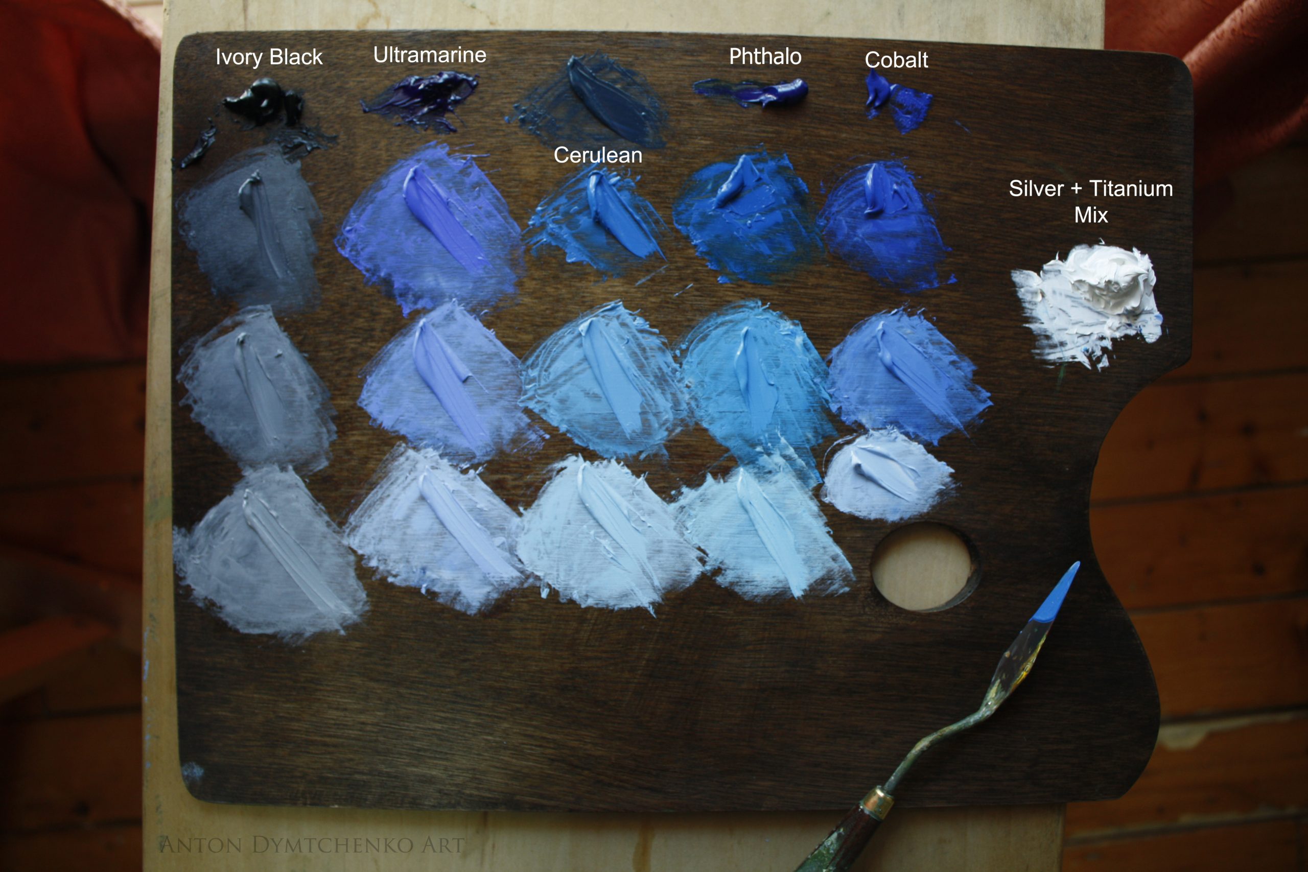
Blue is a primary color. Hence a blue can be produced on its own, it can be altered, but it cannot be mixed from other colors. Usually, it is way too easy to cover a significant area of a painting with the same uniform blue, which makes it rather monotonous. Here is a simple guide to the most useful blues as they come right out of the tube and the noteworthy differences between them.
Cobalt Blue (PB28):
Cobalt blue has been used since the early 19th century. It has a pleasant brightness to it even though it is the most “neutral” of the blues on this list when it comes to temperature. It is stable, lightfast and moderately opaque. It’s useful in portraits as much as in landscapes. However, it is quite pricey.
Phthalo Blue (PB15):
Phthalocyanine Blue (the “Ph” is silent) went into production more than a century after Cobalt. It is colder in temperature (leaning towards green). The pigment has great tinting strength and it’s quite lightfast. It maintains a strong chroma when it is mixed, especially with other vibrant colors like cadmiums.
Cerulean Blue (PB35):
Cerulean Blue came to prominence during the 19th century just like Cobalt. It’s most distinctive feature is the comparatively lighter value it has straight out of the tube. You can see on my palette that I had to add Ivory Black to make it as dark as the other blues. Hence, it’s handy to use if you don’t want to darken your color mix too much. However, it does lean on the cold side when it comes to temperature.
Ultramarine Blue (PB29):
Synthetic Ultramarine Blue (which is what you have in your tube, let’s not kid ourselves, no one is grinding Lapis Lazuli for you) is also an early 19th century invention, even though the organic version of the pigment dates back to the Renaissance. Luckily for us, the affordable synthetic version offers a slightly stronger chroma than its old twin. It is considered warmer than the other blues since it leans strongly towards violet.
Ivory Black (PBL9):
Ivory Black might not sound like a blue and compared to the other ones on this list it doesn’t even look like it; yet when it is greyed down with Flake White, it morphs into a cold bluish grey. In this form, Ivory Black is useful for subtle bluish suggestions. Its “bluishness” shows even more when it is adjacent to areas of strong warm color. Famously, Anders Zorn used Ivory Black instead of more obvious blues on his limited palette to achieve a more understated and unified result.
Sky Tip:
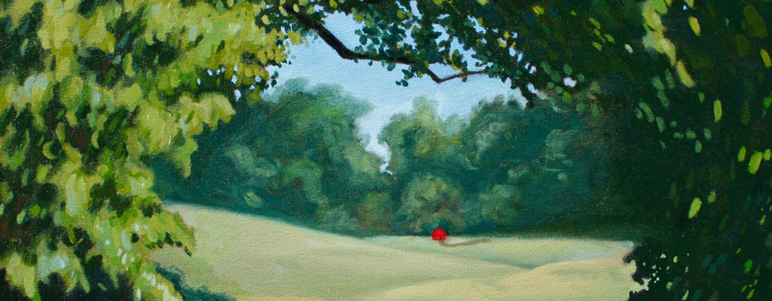
A notable way to make an otherwise boring blue sky more vibrant is to juxtapose brushstrokes of Cerulean and Ultramarine blue (provided they are mixed with Flake White to be the same value). Since one blue is cold and the other—warm; their combination in the sky will create a more engaging variety in temperature. Then, you can go crazy and include Phthalo in there for even more variety.
Remember: Blues can be sad, but not monotonous!


