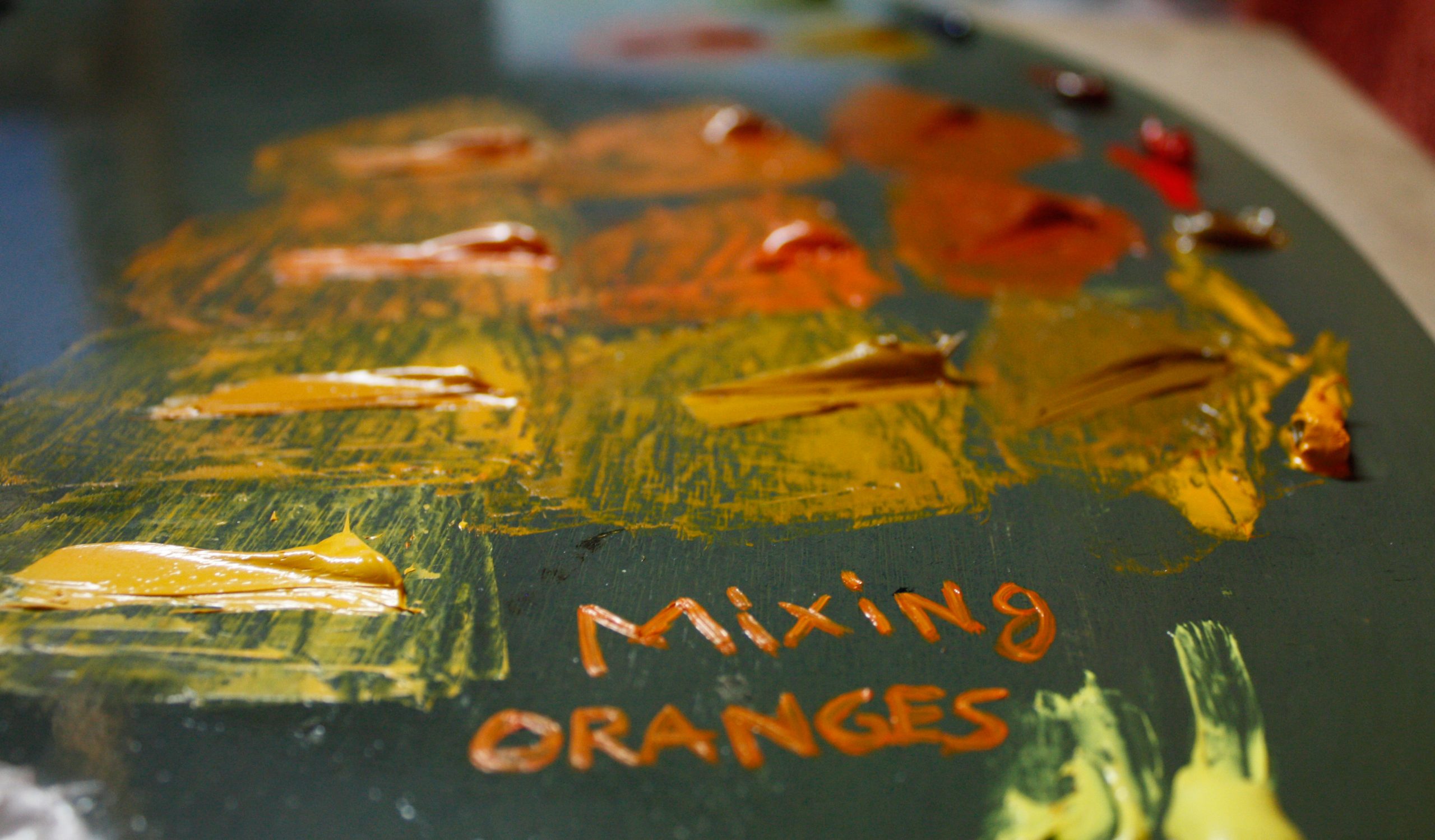

Mixing Oranges
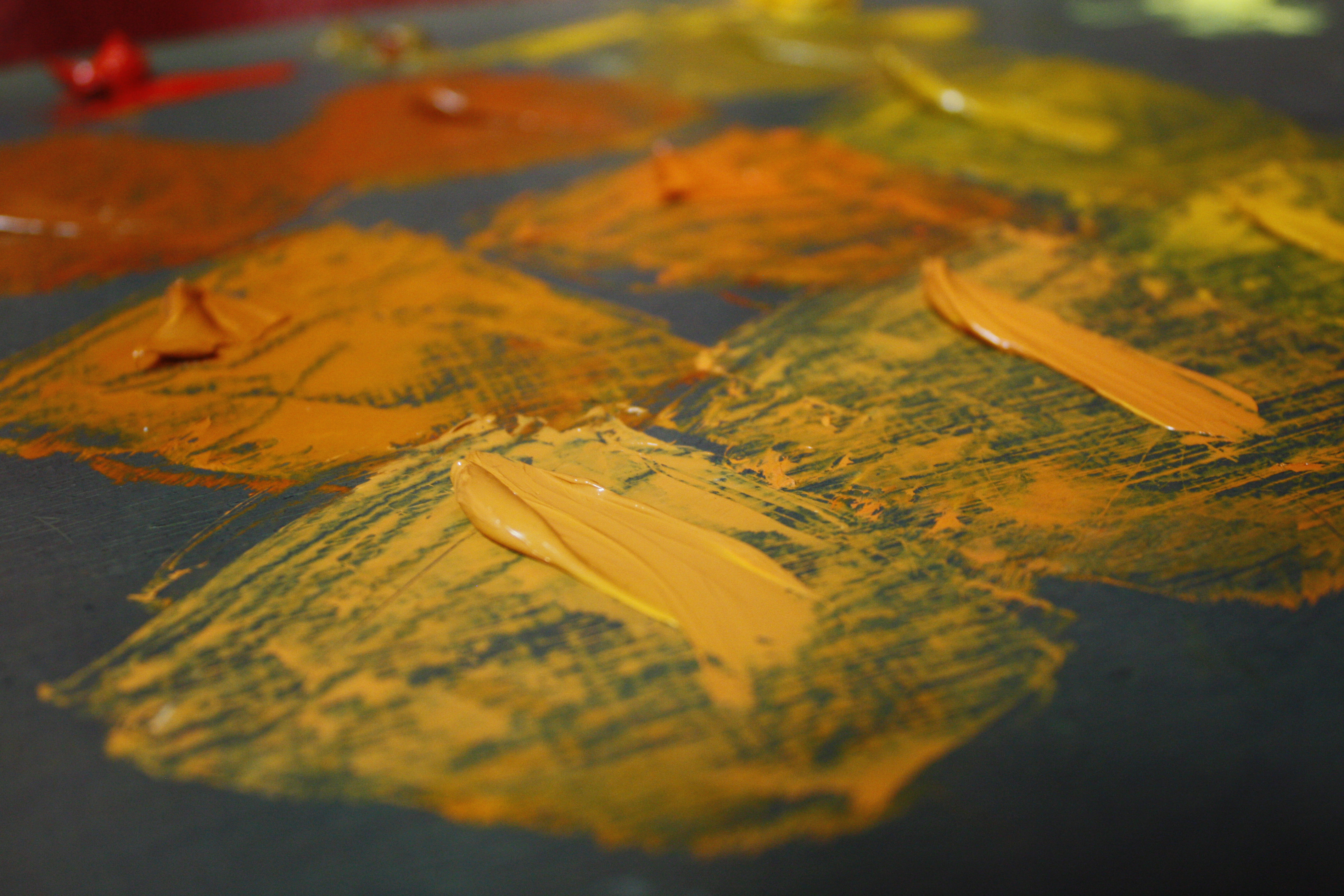
Beginning with greens, I decided to give up the use of pre-mixed secondary colors for painting. Undoubtedly, combining one’s own primary colors allows for more experimentation, flexibility and diversity. Since, in my part of the globe, the rich greens of summer end up morphing into the vibrant oranges of autumn, I repeated the test with mixes of various yellows and reds.
Yellows used:
- Lemon Yellow by Holbein (PY81+PW5),
- Cadmium Yellow by Holbein (PO20+PY37)
- Yellow Ochre by Lefranc (PY42)
Reds used:
- Cadmium Red Light by Holbein (PR108)
- Bright Red by Holbein (PR188/PR48:2)
- English Red by Old Holland (PR101)
- Alizarin Crimson Extra by Old Holland (PV19-PR177-PBR23)
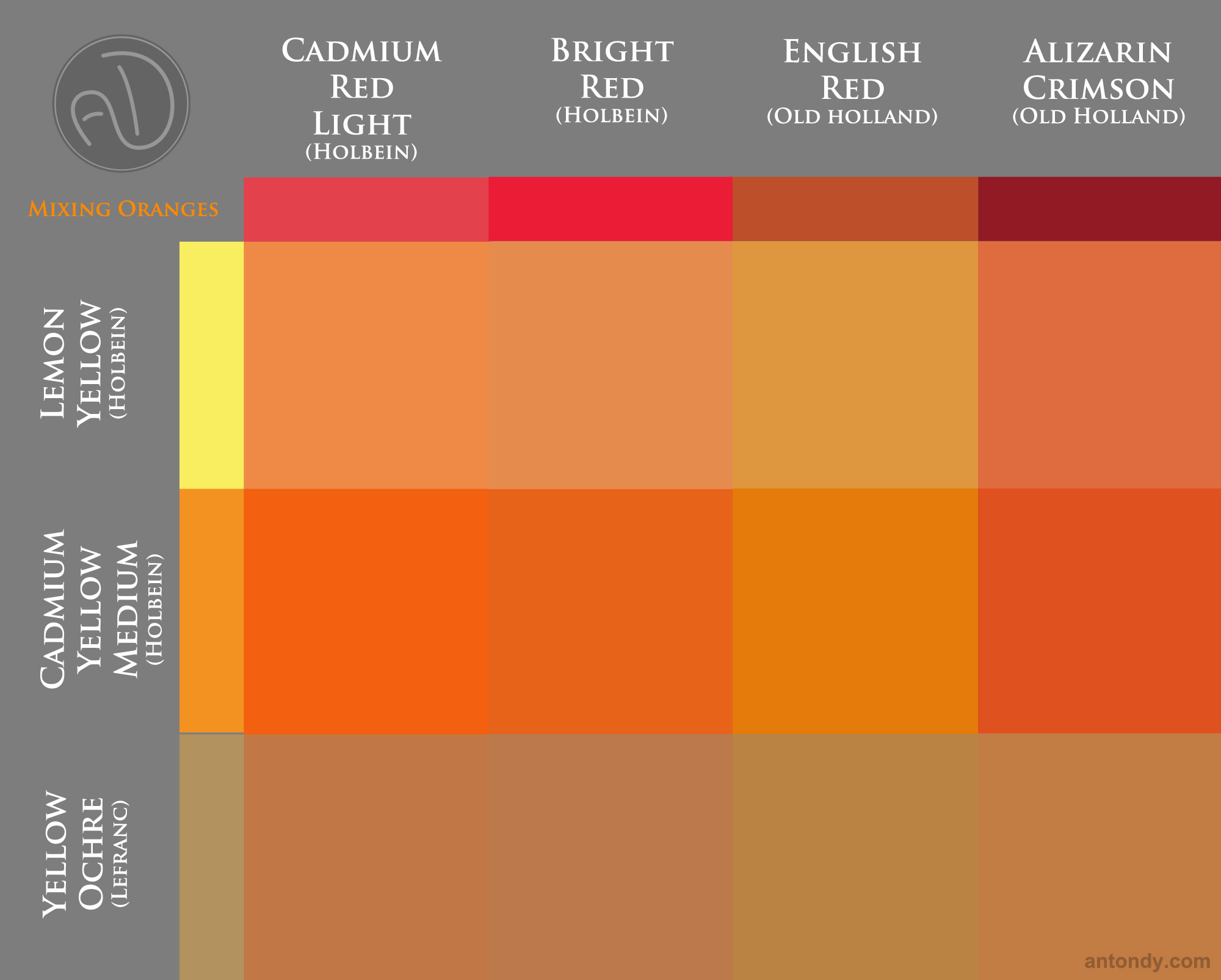
Lemon Yellow makes a colder, lighter and slightly less vibrant orange when mixed with any red. It might serve well to counter balance the warmer, darker and more vibrant areas of a painting.
Cadmium Yellow mixed with Cadmium Red Light or Bright Red creates an intense orange, almost high-lighter like. It is vibrant, luminous and saturated. Although it is very impactful, such intensity is hard to find in nature. It might appear on an autumn leaf directly facing the midday sun, but that is a small percentage of the entire foliage.
When mixed with English Red, the resulting orange is a bit less saturated yet it feels a lot more realistic. It remains warm and pleasant to the eye. Its hue approaches yellow more than red.
When mixed with Alizarin Crimson, the ensuing orange also gains in realism. Yet, as opposed to English Red, the hue is closer to red than yellow.
Yellow Ochre mixed with any of the reds produces a dulled down version of all the oranges mentioned previously. Its lack of saturation stands in complete opposition to the Cadmium Yellow/Cadmium Red mix. The least saturated orange was undoubtedly the Yellow Ochre/English Red mix. It could almost be called Orange Ochre.
Nevertheless, it is wise to remember that high saturation carries more impact when it is juxtaposed with low saturation somewhere in the painting (to avoid sensory overload).
That’s that for this round of try-out mixes. I am looking forward to try even more yellows and reds eventually, but for now I have plenty to play with.